React Tilt Button
A physical, 3D tactile React button component with tilt, squish, and real depth.
🔗 Live Demo: https://react-tilt-button.vercel.app/
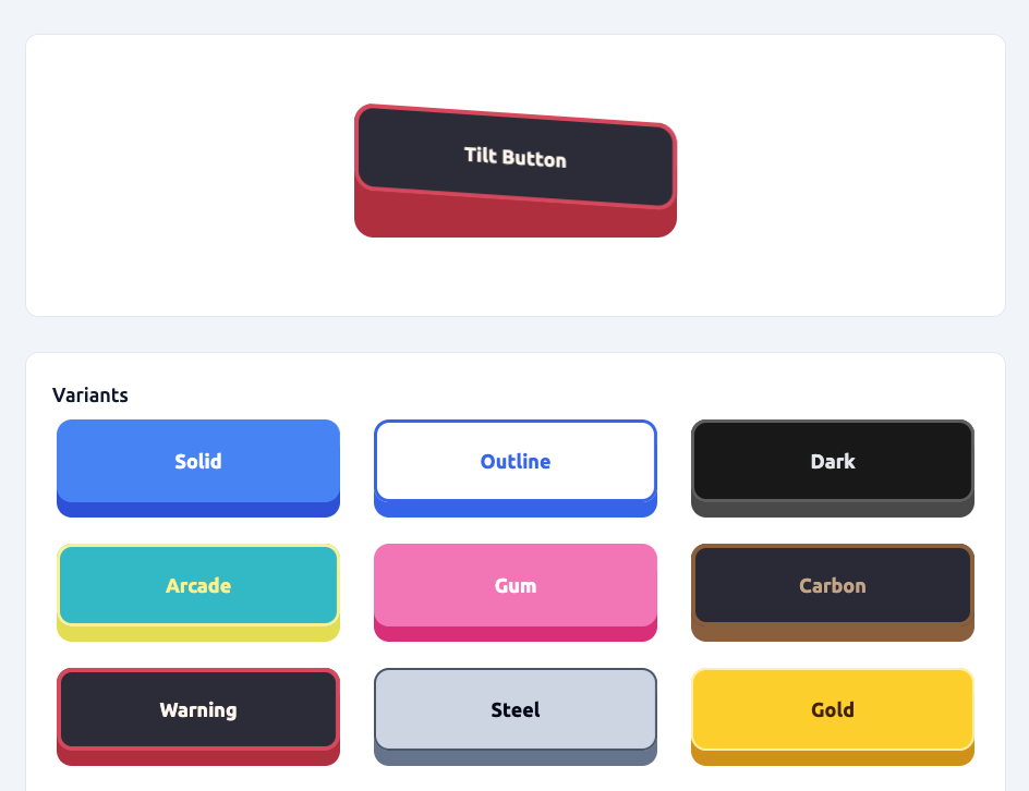
Features:
- Tilts on hover (left / middle / right)
- Squishes on press
- Has a visible “side wall” (depth)
- Enforces physical constraints so it never breaks
- Supports predefined style variants
- Is fully configurable via props
Inspired by react-awesome-button, but implemented as a small, dependency-free component.
Installation
npm install react-tilt-button
import { TiltButton } from 'react-tilt-button';
Basic Usage
<TiltButton onClick={() => alert('Clicked!')}>Click me</TiltButton>
Using Variants
Variants are predefined visual styles (material / theme presets).
<TiltButton variant="solid">Solid</TiltButton>
<TiltButton variant="outline">Outline</TiltButton>
<TiltButton variant="arcade">Arcade</TiltButton>
<TiltButton variant="carbon">Carbon</TiltButton>
<TiltButton variant="warning">Warning</TiltButton>
You can still override any value manually:
<TiltButton
    variant='solid'
    surfaceColor='#10b981'
>
    Custom Green
</TiltButton>
Demo
Try it live here:
👉 https://react-tilt-button.vercel.app/
The demo lets you:
- Test all variants
- Change geometry (depth, radius, tilt, etc.)
- See physical constraints in action
- Copy settings for your own usage
Full Example
<TiltButton
    variant='arcade'
    width={400}
    height={120}
    elevation={20}
    pressInset={10}
    tilt={4}
    radius={14}
    motion={160}
>
    My Button
</TiltButton>
Physical Constraints (Important)
The component automatically clamps values:
elevation ≤ height * 0.3pressInset ≤ elevationtilt ≤ elevation / 9radius ≤ (height - elevation) / 4
So the button:
- Never crashes
- Never inverts
- Never visually breaks
Props
Core
| Prop | Type | Default |
|---|
children | ReactNode | span |
onClick | function | undefined |
disabled | boolean | false |
Variant
| Prop | Type | Default | Description |
|---|
variant | string | solid | Predefined visual style preset |
Geometry
| Prop | Type | Default | Notes |
|---|
width | number | string | 260 | No max |
height | number | string | 64 | No max |
elevation | number | 14 | Clamped to height * 0.3 |
pressInset | number | 5 | Clamped to <= elevation |
tilt | number | 2 | Clamped to <= elevation / 9 |
pressTilt | boolean | true | When true, the button keeps its skew while pressing |
radius | number | 14 | Clamped to <= faceHeight / 4 |
motion | number (ms) | 160 | Animation speed |
Colors (Optional Overrides)
These override the selected variant.
| Prop |
|---|
surfaceColor |
sideColor |
textColor |
Border (Optional Overrides)
| Prop |
|---|
borderColor |
borderWidth |
Glare / Specular Highlight (Optional)
The button supports a dynamic specular glare highlight that simulates light reflecting off the surface.
It automatically shifts based on hover position (left / middle / right) and fades out on press.
Props
| Prop | Type | Default | Description |
|---|
glareColor | string | #ffffff | Color of the glare highlight |
glareOpacity | number | 0 | Intensity of the glare (0 → 1) |
glareWidth | number | 0 | Width of glare band (0 → 100, in %) |
Example
<TiltButton
    glareColor='#ffffff'
    glareOpacity={0.12}
    glareWidth={60}
>
    Shiny Button
</TiltButton>
Misc
| Prop | Description |
|---|
className | Extra classes |
style | Merged into inline styles |
...props | Passed to <button> |
Behavior
- Action fires on mouse release
- Hover is split into left / middle / right zones
- This is a physical UI primitive, not a flat semantic button
Styling
All visuals are driven by CSS variables:
--button-raise-level--press-inset--button-hover-pressure--radius--surface-color--side-color--text-color--border-color--border-width--glare-rgb--glare-alpha--glare-width
So you can theme it externally if needed.